We map out how users move through your website or product, helping identify confusing steps, missing information, and areas that need a clearer path.
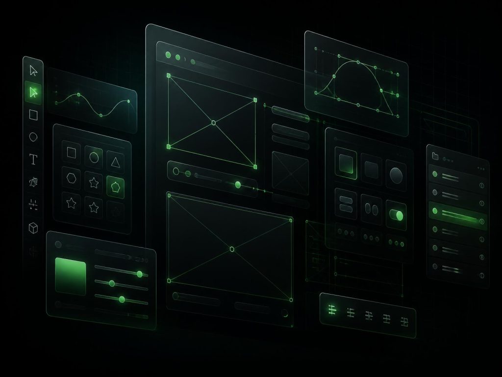
We create simple wireframes in Figma to work through page layouts, navigation, content placement, and key actions before detailed visual design begins.
We design website layouts and user journeys that make important information easy to find and key actions straightforward across desktop, tablet, and mobile.
We link screens together in Figma so you can click through important journeys and review how the experience works before development starts.
We design layouts for desktop, tablet, and mobile, considering different screen sizes, content changes, and the states users may encounter.

We organize reusable components, styles, screens, and design details in Figma so your development team has a clear reference when building the final product.
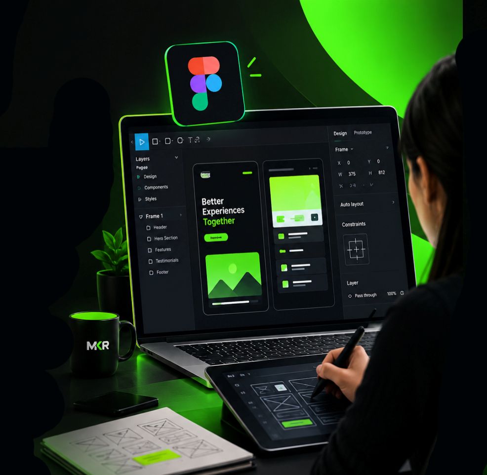
We learn about your business, users, existing interface, and what you want the new or improved design to achieve.
We plan the important pages, screens, navigation, and user flows, then use wireframes to establish the layout before adding visual details.
We develop the high-fidelity Figma screens, applying consistent components, typography, spacing, and visual elements across the interface.
We refine the designs based on your feedback, prepare the required prototype and responsive screens, and organize the Figma files for development.
Every screen we design in Figma is built so people know where to look and what to click. When a design is easy to follow, people stay longer and are more likely to contact you or buy.
Menus, buttons, and icons sit in familiar places on every screen, so nobody has to figure out how your site works.
Labels like "Get A Quote" say more than "Submit," so people know what happens when they click.
We design forms that ask only for what's needed, so more people finish them instead of leaving halfway.
Each screen shows only what people need at that step, so they don't feel overwhelmed.
Contact details and reviews are placed where people look for them before they get in touch.
Each page has one main purpose, so extra links and banners don't pull people away from it.
We design with realistic content, not just placeholder text, so the layout still works once your real content goes in.
We plan for moments like empty screens, errors, loading, and confirmations, so users are never left unsure what's happening.
We look at the tasks users need to complete, like booking or buying, and take out any extra steps that get in the way.
WHAT OUR CLIENTS SAY
FAQs
Tell us what you're building, who your users are, and what you need designed. As a Figma design agency, we'll help you find the right approach for your project.